Design systems that hold up. Prototypes that keep pace.
Bringing an HR platform back into system alignment—and rebuilding how the team prototyped with AI.
UKG People Assist had drifted from its own design system. Components were duplicated, color usage was inconsistent, and interaction patterns existed in multiple conflicting forms. In parallel, prototyping remained slow and limited—Figma hotspots could not support the breadth of a real HR case.
Over one focused month I audited and upgraded the component library, introduced semantic tokens and variables, and replaced traditional prototyping with high-fidelity, AI-assisted applications built in Replit and Claude. The result: a coherent system, prototypes that testers treated as the live product, and a repeatable process the team could continue using.
An HR platform that had outgrown its own system
UKG People Assist is a SaaS platform that gives employees and managers a single place for HR tasks—requests, approvals, benefits, case management, and support escalation. Like many products that scale across multiple feature teams, the interface had gradually diverged from the design system it was meant to follow.
Components had been locally overridden. Color usage varied between similar screens. Several interaction patterns existed in two or three slightly different forms depending on which team had shipped them. None of this was catastrophic on its own, but together it made the product feel less coherent, slowed design–engineering handoff, and made it difficult to test new ideas without first untangling which version of a pattern a given screen was using.
I joined as Senior UX Designer with a clear mandate: bring the application back into alignment with the rest of the system, upgrade components where the system itself was falling short, and establish a faster, more reliable prototyping process that could support user research without requiring full engineering builds.
“We can’t tell if this pattern is the current one or the old one anymore.”
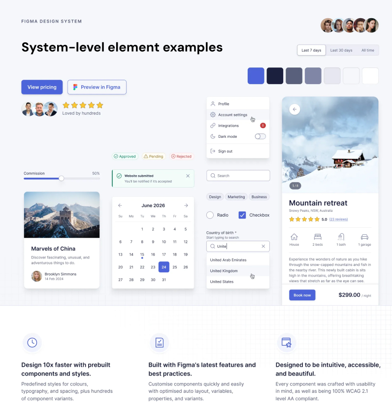
design system
Auditing, upgrading, and re-grounding the component library
The first phase was diagnostic. I systematically identified every place the product had diverged from the system and decided, case by case, whether the divergence was simple drift to correct or a genuine gap the system needed to grow to cover.
Component audit
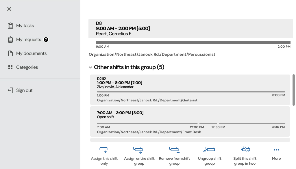
I went screen by screen through the application, cataloguing every instance of core components—inputs, tables, cards, status indicators, navigation—and flagged where an implementation no longer matched its system source. Some issues were straightforward (a spacing override, a stale corner radius). Others revealed real usability gaps that the existing components did not yet solve, particularly around dense data tables and multi-step case management flows.
Tokens, variables, and color modes
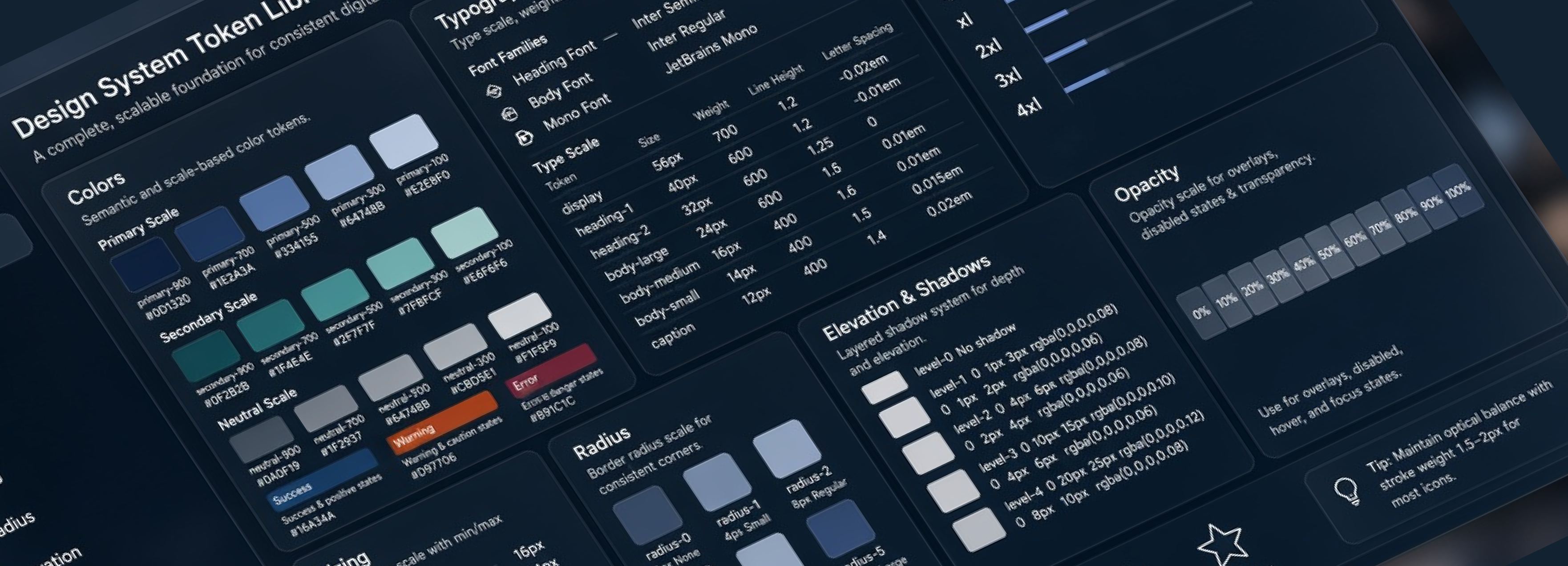
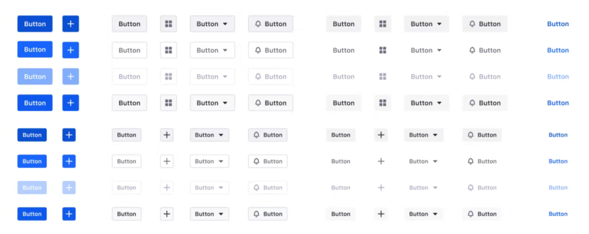
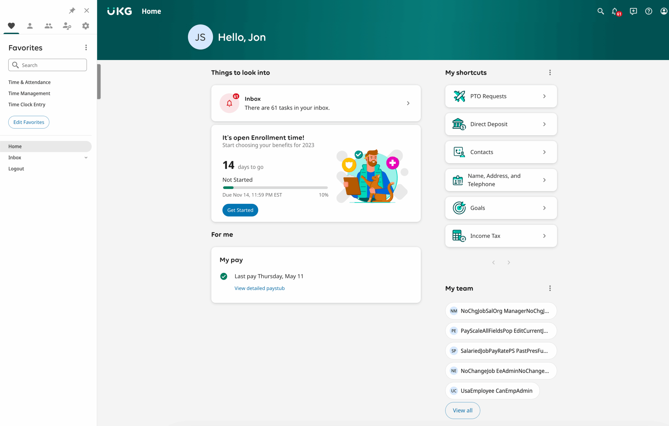
A significant portion of the upgrade work happened at the token layer. I restructured color and spacing tokens using Figma Variables so that semantic tokens (surface/default, text/muted, border/focus) resolved automatically to the correct primitive values. Designers no longer picked raw hex values per screen. This enabled light and high-contrast modes without maintaining parallel component sets, and made accessibility contrast checks a structural property of the system rather than a per-designer memory task.
Presenting improvements back into the system
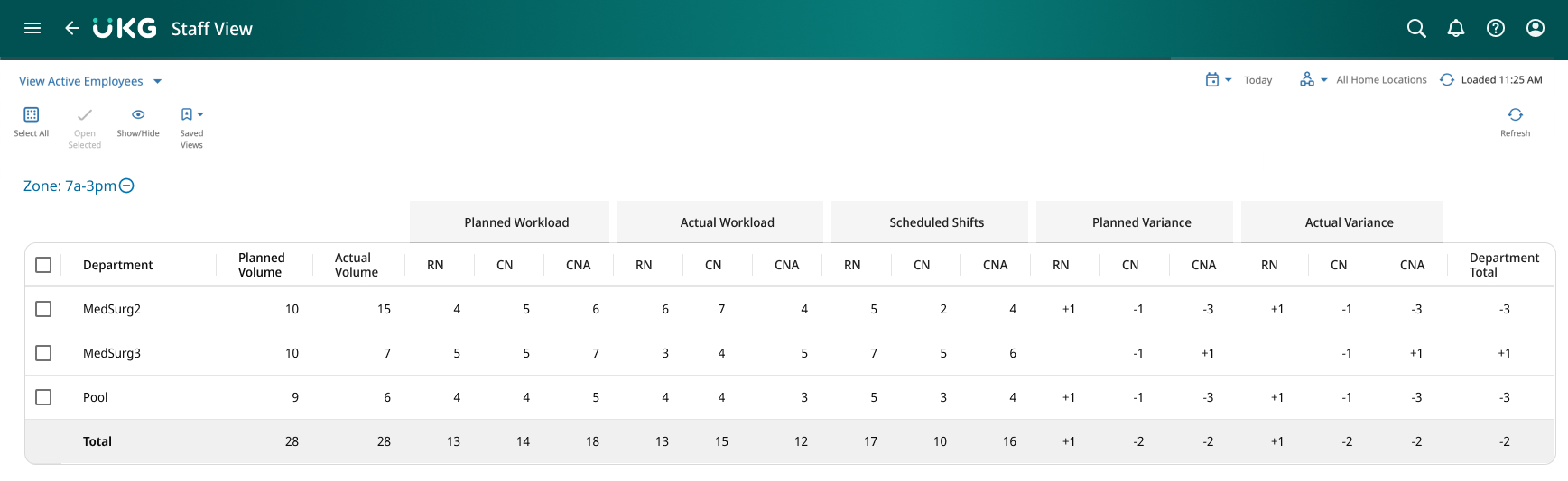
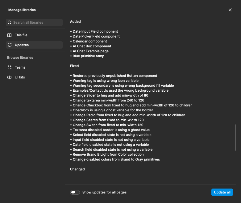
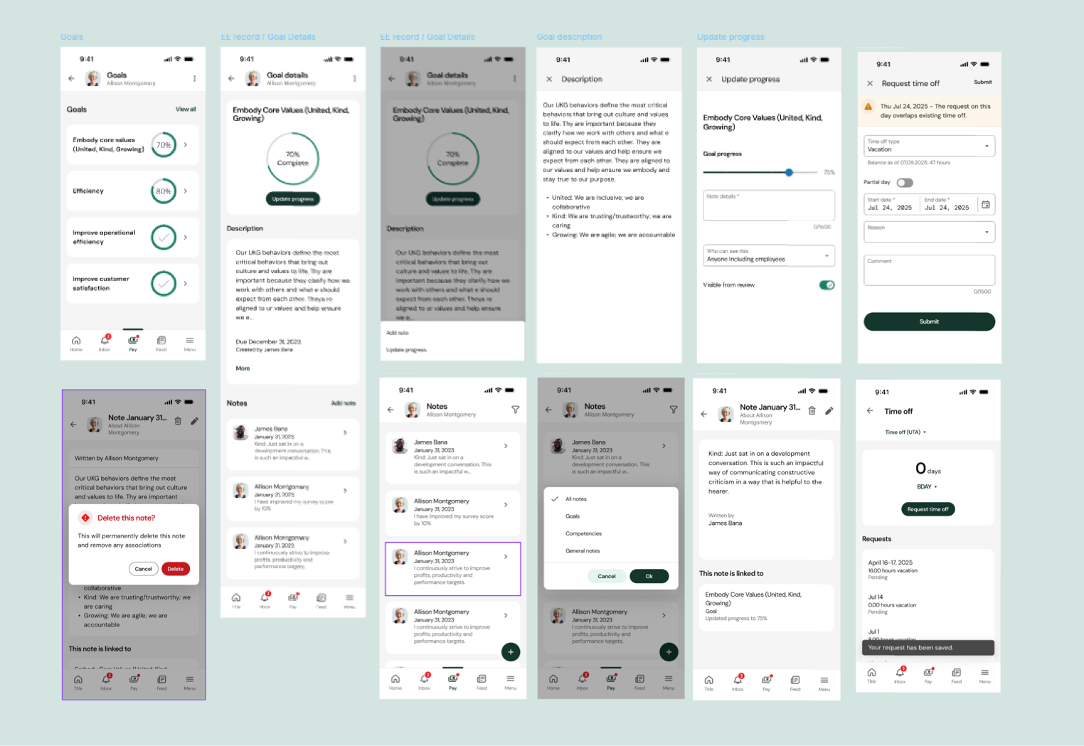
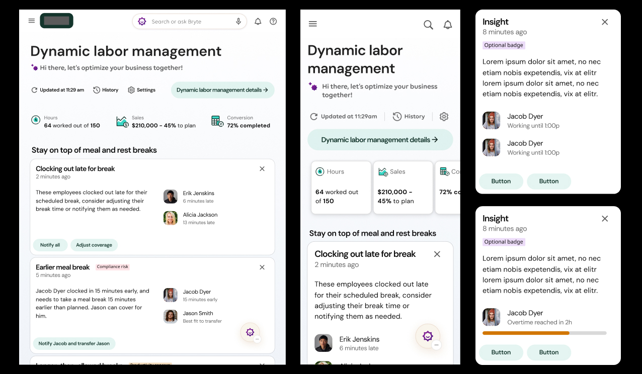
Where the audit surfaced a genuine gap rather than simple drift, I prepared proposals with usability rationale, before/after comparisons, and updated component specs, then presented them to the design system’s governance group. Several were adopted directly into the shared library: a revised data-table row pattern for case management, a clearer multi-state status badge, and a consolidated approval-action pattern that replaced three near-duplicate versions that had spread across different features.
ai-assisted prototyping
Prototypes no one could tell weren’t real
Aligning the system fixed what the product looked like. The larger shift was in how we tested what it should look like next. Figma prototyping remained reliable for individual flows, but it became slow and limited once a concept needed to cover the full breadth of a real HR case—moving across requests, approvals, notifications, and support in one continuous, believable session.
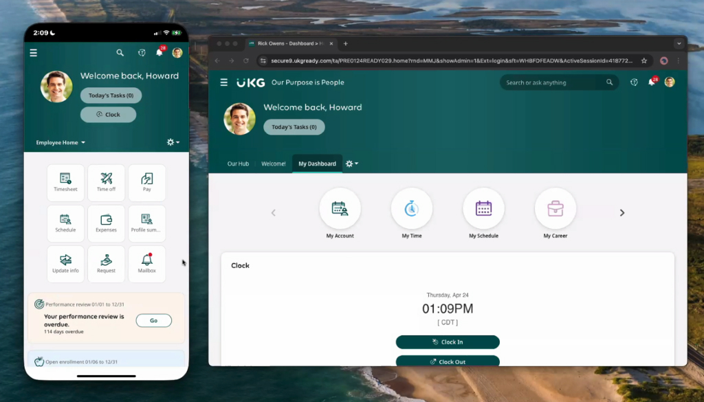
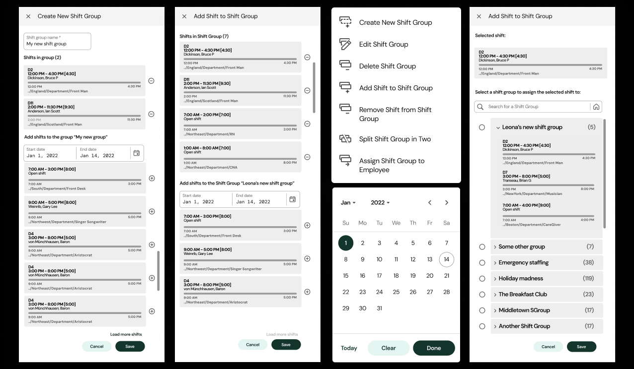
Above is a capture of a prototype generated from a defined Figma flow and rendered through Replit into complete working front-end code. Fidelity was high enough that participants in usability sessions treated it as the production application. The behavior we observed—hesitation, backtracking, wrong turns, confidence—became a far more honest signal than what is typically captured when people know they are clicking through a mockup.
The India-based engineering team used the generated code as a living reference for implementation. This reduced miscommunication between design and engineering and shortened the path from validated concept to production. Joint review sessions allowed engineers to experience the intended flow directly and ask clarifying questions in context.
The workflow
-
Design in Figma, on-system.
Screens were built directly from the upgraded component library and token set, so what shipped to prototyping was already system-accurate—not a one-off mockup that would need reconciliation later. -
Hand the structure to Claude.
Claude turned a well-specified flow—screen structure, states, copy, and logic branches—into working front-end code with real navigation, real conditional states (approved / pending / denied), and real form validation rather than simple click-to-next hotspots. -
Assemble and run in Replit.
Replit hosted the generated prototype as a running application reachable by a simple link. No Figma file, no plugin, no “prototype mode” was required. Copies could be forked and improved quickly without unintended deviations from the original design. -
Iterate against real usage.
Because the prototype behaved like the product, research could observe users actually attempting to complete tasks—not merely advancing along a predetermined path—and identify points of hesitation or recovery.
- Coverage limited to flows explicitly wired with hotspots
- Edge cases and conditional states were easy to skip
- Testers could tell it was a prototype, shaping their behavior
- Each new scenario required re-linking frames by hand
- Full application coverage—every area present and clickable
- Real logic caused edge cases to surface naturally
- High fidelity led testers to engage as if using the live product
- New scenarios were described and regenerated, not rebuilt
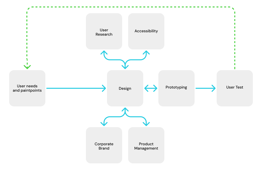
The fidelity threshold this process reached was the decisive factor. Participants treated the prototype as production software. That honesty of signal directly improved the quality of findings around task completion, time-to-task, and support contact rates.