eric e. dolecki
philosophy
Work Philosophy System Design
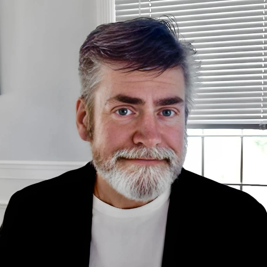
Eric E. Dolecki

Less,
but better.

A working philosophy
Interfaces designed as tools. Features designed to recede.
Lineage
Rand · Rams · Ive · Vignelli · Fukasawa · Kare
Practice
Digital products · systems · interaction
 

01 — manifesto

Design is not the last coat of paint.

It is the work of making something inevitable.

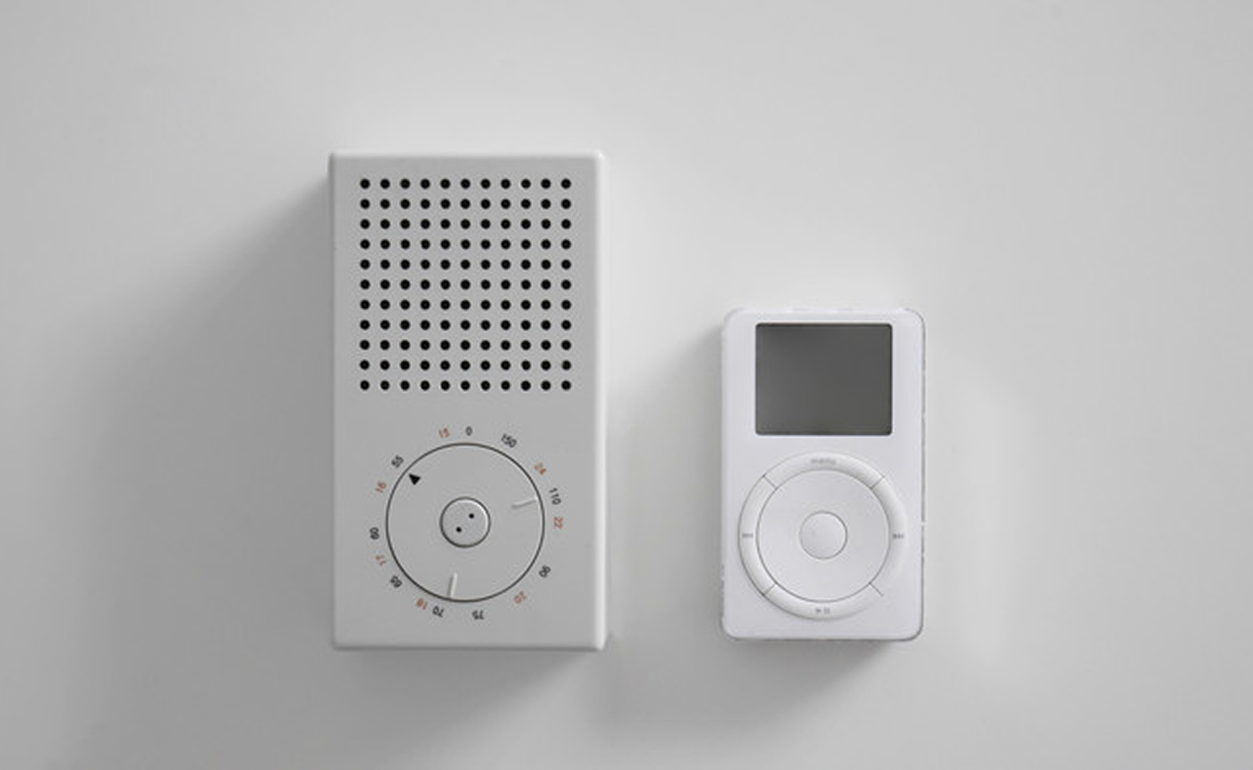
Design is not decoration applied to an idea that already exists. It is the discipline of purpose, form, and restraint held in the same hand. A screen can carry the same moral weight as a Braun radio, an IBM mark, or a piece of milled aluminum. The medium changed. The obligation did not.

I design digital interfaces the way the best objects in the world were designed: not to be noticed, but to be lived with. If a control, a flow, a feature cannot survive the question — of course it is that way; why would it be any other way? — it is not finished.
Placeholder: modular grid

Fig. 01 — Order before ornament

The highest compliment an interface can receive is that no one mentions it.

People did not arrive to express my taste. They arrived to do something that matters to them. Navigation should feel like walking through a well-made house. A setting should be findable without being advertised. A powerful capability should arrive at the moment of need and then get out of the way.

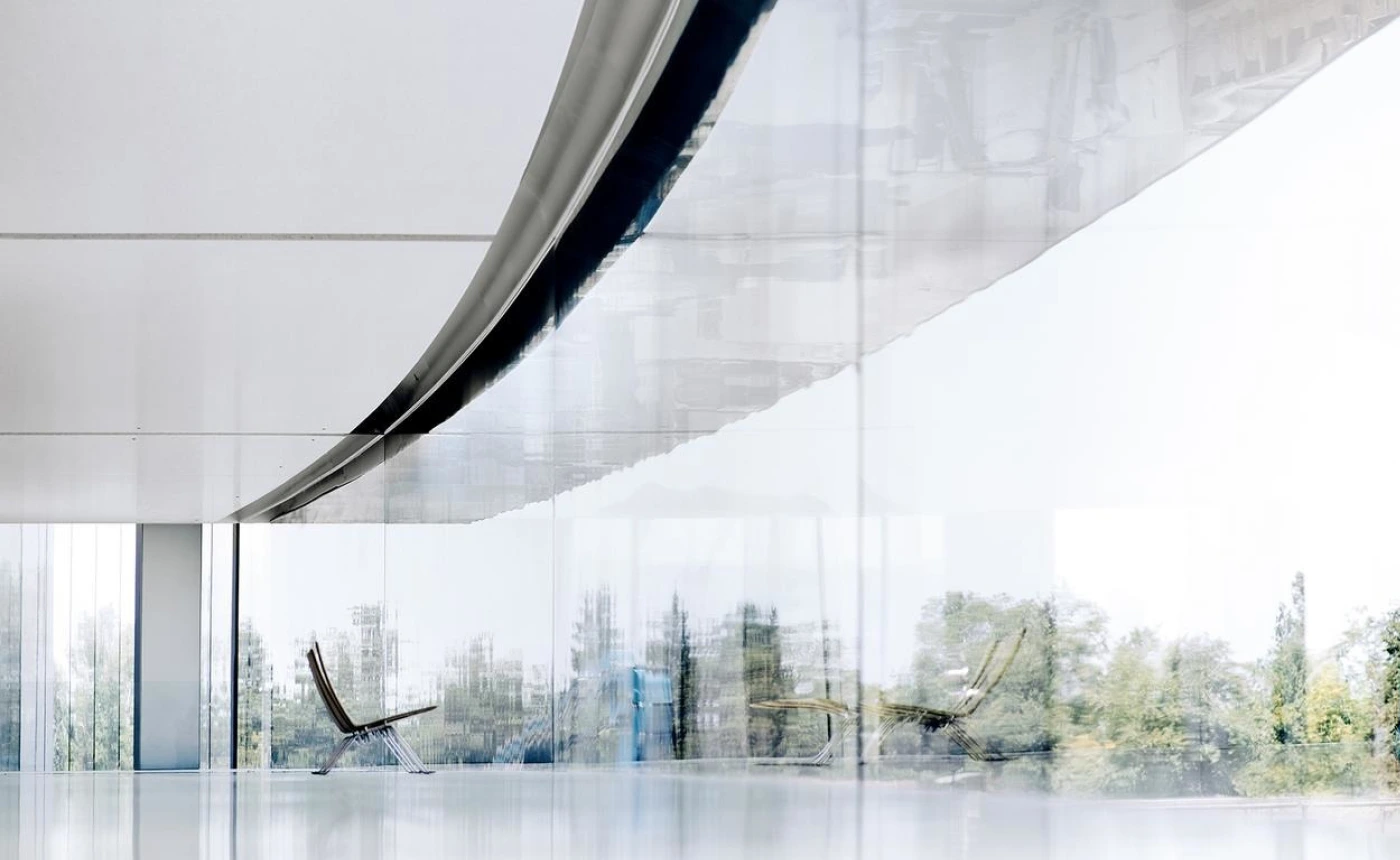
Apple Park by Jony Ive

Placeholder: industrial object

02 — lineage

Working under standards, not moods.

These are not influences I quote for atmosphere. They are the measures I work under when a feature wants to become more than it needs to be.

Paul Rand

Form and content, locked

To design is to add value and meaning — to illuminate, simplify, clarify, dignify, and perhaps amuse. A mark is an ambassador. Simplicity is a means of memory, not a style.

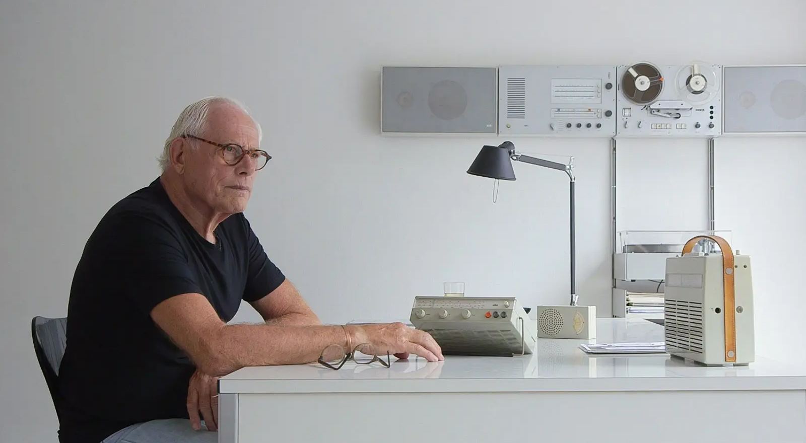
Dieter Rams

Weniger, aber besser

Good design is useful, honest, unobtrusive, long-lasting, and thorough to the last detail. And finally: as little design as possible.

Jony Ive

The inevitable solution

True simplicity is not the absence of clutter. Clutter’s absence is a side effect. Real simplicity is order brought to complexity until the result feels unavoidable.

Kindred

Vignelli · Fukasawa · Kare

Discipline as freedom. Design without thought. Humanity inside a grid of pixels. The details are not the details. They make the design.


03 — reduction

Most can add. The work is in taking away.

When designing a feature, I start with the full honest complexity of the problem. Then I remove until the remaining structure can explain itself. Every extra state, every extra label, every extra branch is a tax the user will pay forever. I do not wish to ever ship something taxing.

Reduction is not emptiness. It is concentration. A single primary action, correctly placed, is more generous than six competing ones. White space is not leftover. It is the part of the composition that lets the rest breathe.

Applied simplicity
  • Looks quiet, remains complicated
  • Ornament removed, structure untouched
  • Novelty mistaken for progress
  • The screenshot is the goal
Earned simplicity
  • Looks quiet because it is
  • Parts removed because they were unnecessary
  • Innovation tied to a real capability
  • The tenth minute of a Tuesday is the goal

Placeholder: reduced composition

Fig. 02 — What remains after the unnecessary leaves

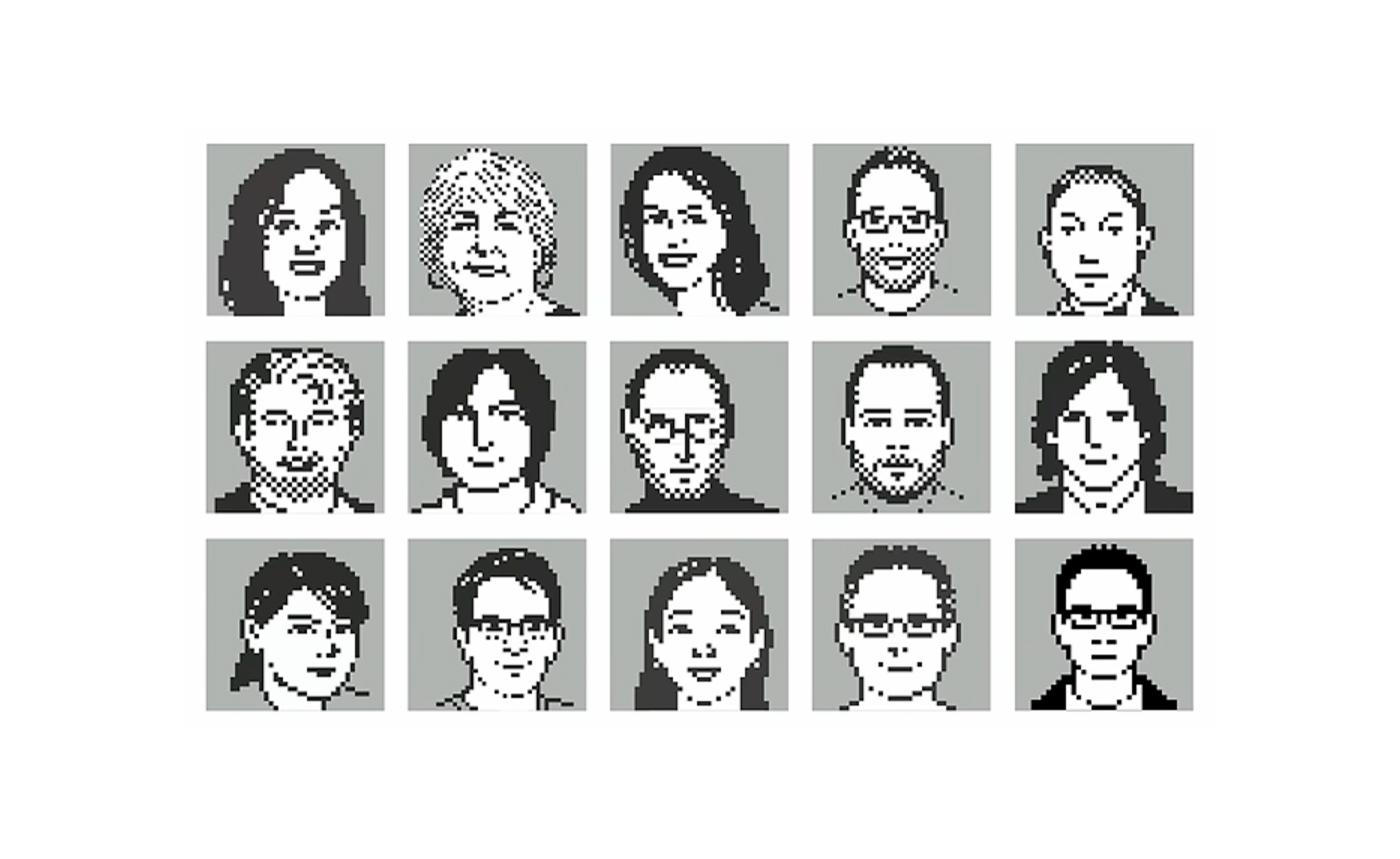
Susan Kare Pixel Portraits

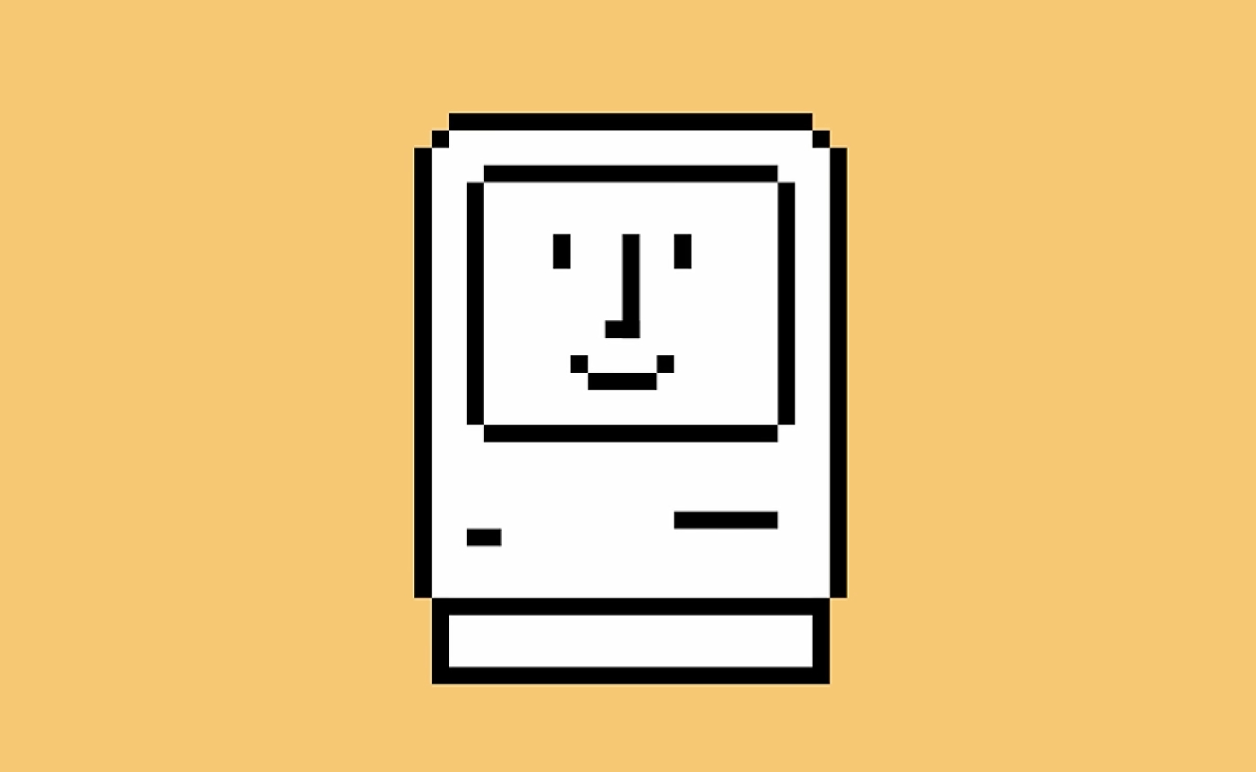
Susan Kare Mac Icon

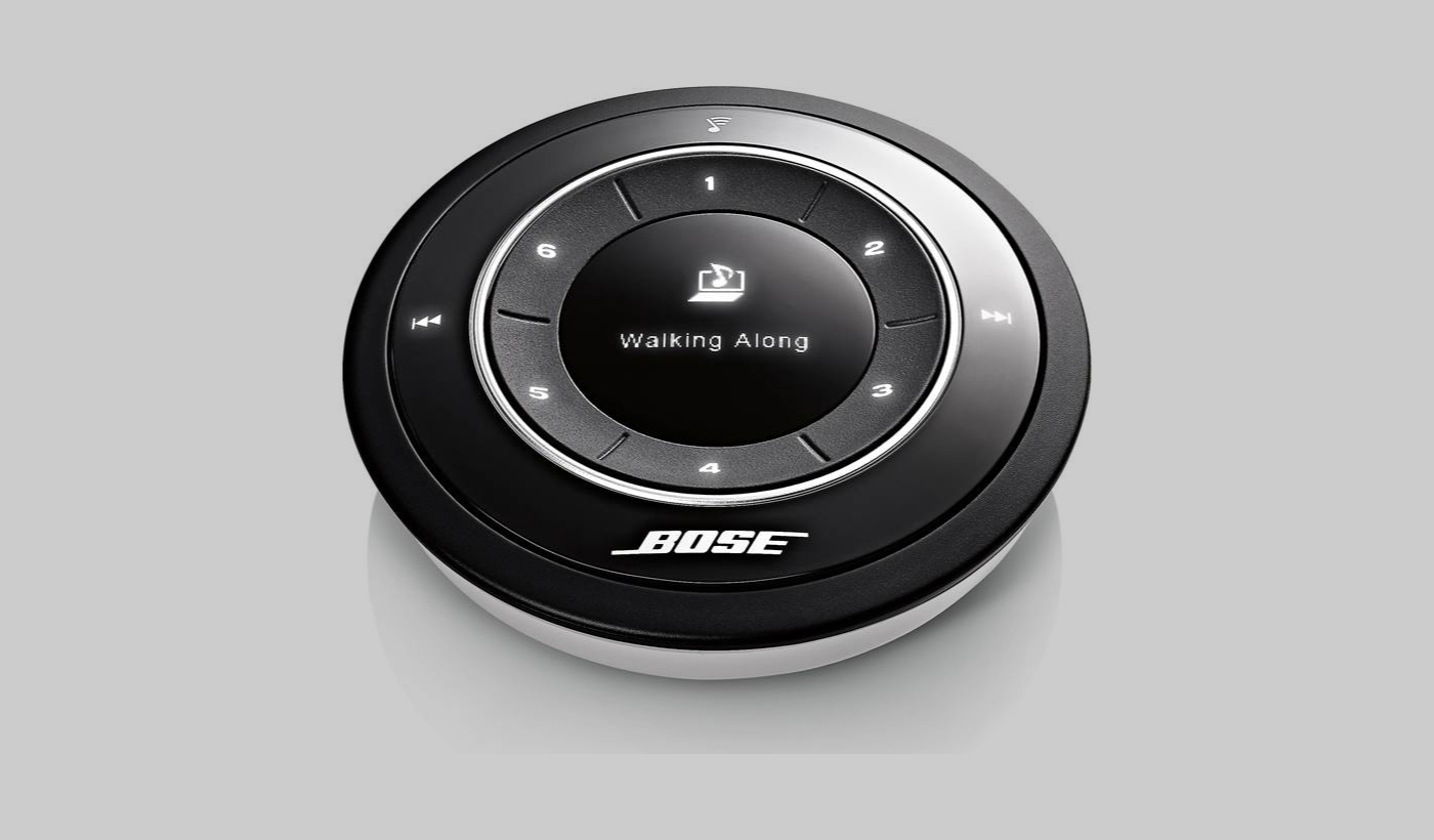
Products that fulfill a purpose are like tools. Dieter Rams — Good design is unobtrusive

04 — principles

How the work is judged.

Rams asked whether a design was good. I ask the same of every interface and every feature, in language the screen can answer.

01

Useful before impressive

A feature must make the product more useful — functionally, psychologically, aesthetically — or it is only a meeting artifact.

02

Understandable by use

Hierarchy should be felt before it is read. If a feature needs a paragraph to introduce itself, the feature is not ready.

03

Unobtrusive

The interface is not the destination. The person’s work is. Design that performs is design that interrupts.

04

Honest materials

Type, color, motion, and space are materials. I do not dress a thin capability in thick chrome, or hide limitation behind delight.

05

Thorough to the last pixel

Empty states, errors, last items, abandoned sessions. If it is only beautiful on the happy path, it is illustrated, not designed.

06

Long-lasting

Trends are planned obsolescence for the eye. I would rather a surface feel quiet on the day it ships and at home five years later.

07

As little design as possible

The unused control, the extra voice, the cleverness only the designer enjoys: these are the enemies of good work.

On innovation: New interaction for its own sake is façade. The only innovation worth the complexity it introduces is the kind that makes a human task newly possible, newly calm, or newly clear.
Placeholder: quiet interface study

05 — practice

Features as tools, not monuments.

I do not design for the screenshot.

I design for interruption, for one-handed use, for poor light, for the person who already knows what they want and the person who does not. The most important part of an interface is often the part that is not there: the decision not to ask, the default that is already right, the memory the system keeps so the person does not have to.

Placeholder: tool in use

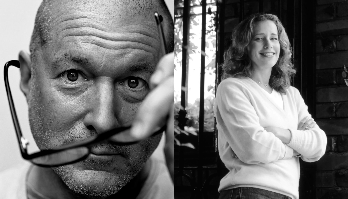
Fig. 03 — The body already knows : Jony Ive and Susan Kare

The sequence

  1. Begin in play. Weigh relationships. Let a metaphor live long enough to fail. Search until form and content lock.
  2. Then stop playing. What remains must be able to live for years, not for a release week.
  3. Design the complete object. First encounter, hundredth return, error, empty state, after-success quiet.
  4. Invent only when the old language cannot tell the truth. Familiar patterns are literacy, not a failure of imagination.

06 — materials

Even digital things have grain.

Type
Chosen because it can carry a paragraph and a button with equal dignity — not because it is fashionable.
Color
Not a costume change. Signal: emphasis, state, calm, warning. Used sparingly enough that it means something.
Motion
Mass and reason. Things move because they are related, arriving, or resolving — not because motion is available.
  • Space is architecture. Padding is not a leftover number in a specification.
  • Care is visible in the places no one asked you to care.
  • Wit is welcome when it does not delay use. Wit that delays use is interruption.
  • Every screen teaches people what the product believes about them. I want mine to believe they are intelligent, busy, and deserving of calm.
Design is the silent ambassador of the product.

If the interface I make can become a tool in someone’s life — if it can recede, last, tell the truth, and still be a pleasure to behold — then it has done what the work was always asking design to do. It has become silent. It has become clear. It has become, as far as an object of use can be, inevitable.

Placeholder: final study