Delivering intuitive user experiences: showcasing exemplary design and execution.

One of a kind
I exercise a unique combination of skills as a senior product designer, prototyper, and UI/UX designer. I have strengths in user-centered interface design, concept ideation, wireframing, problem solving, prototyping, and software development. I excel at integrating both creative and analytical thinking into every project I undertake. Let me be your thought partner.
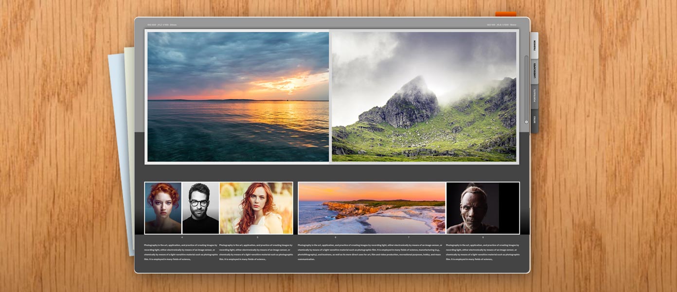
Work examples
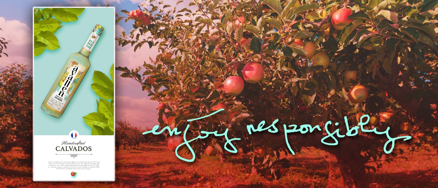
View project details ›
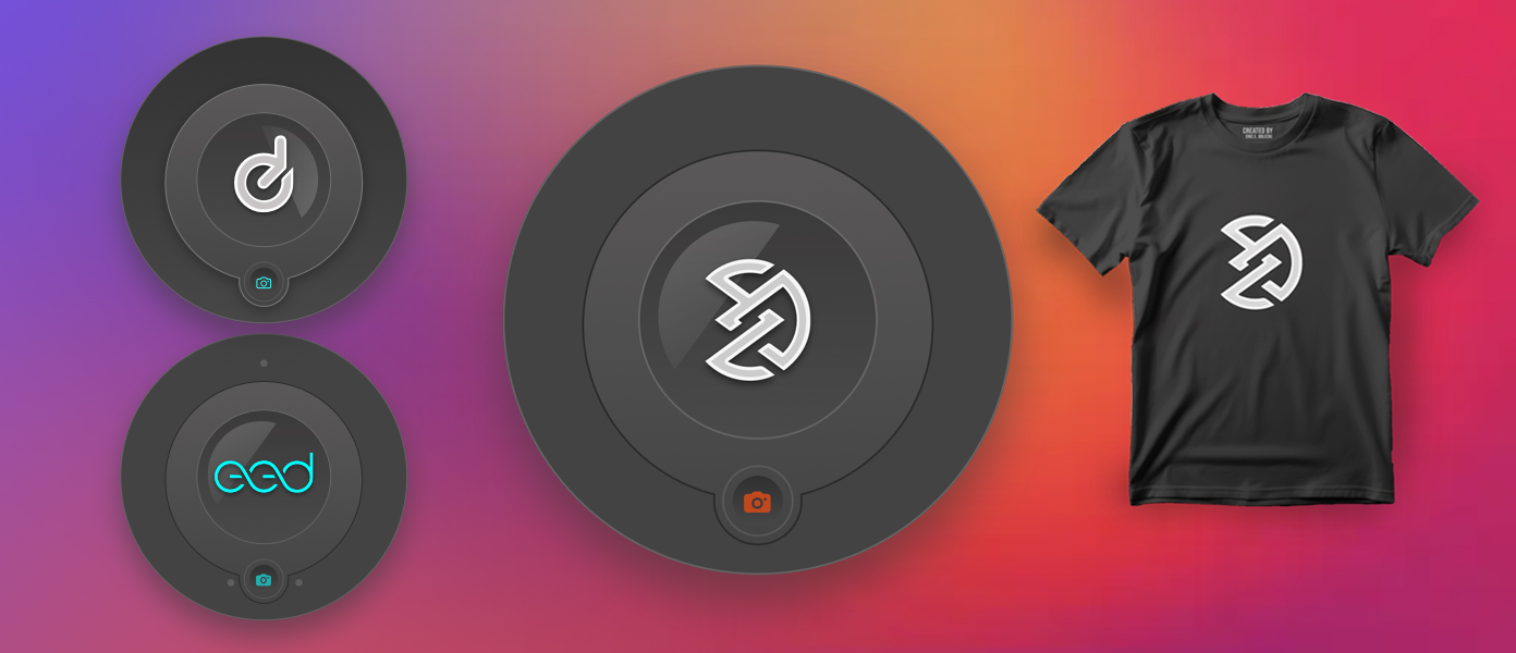
View project details ›

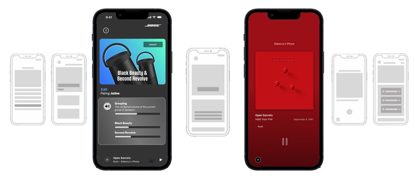
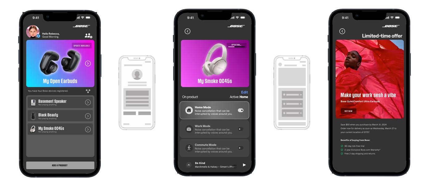
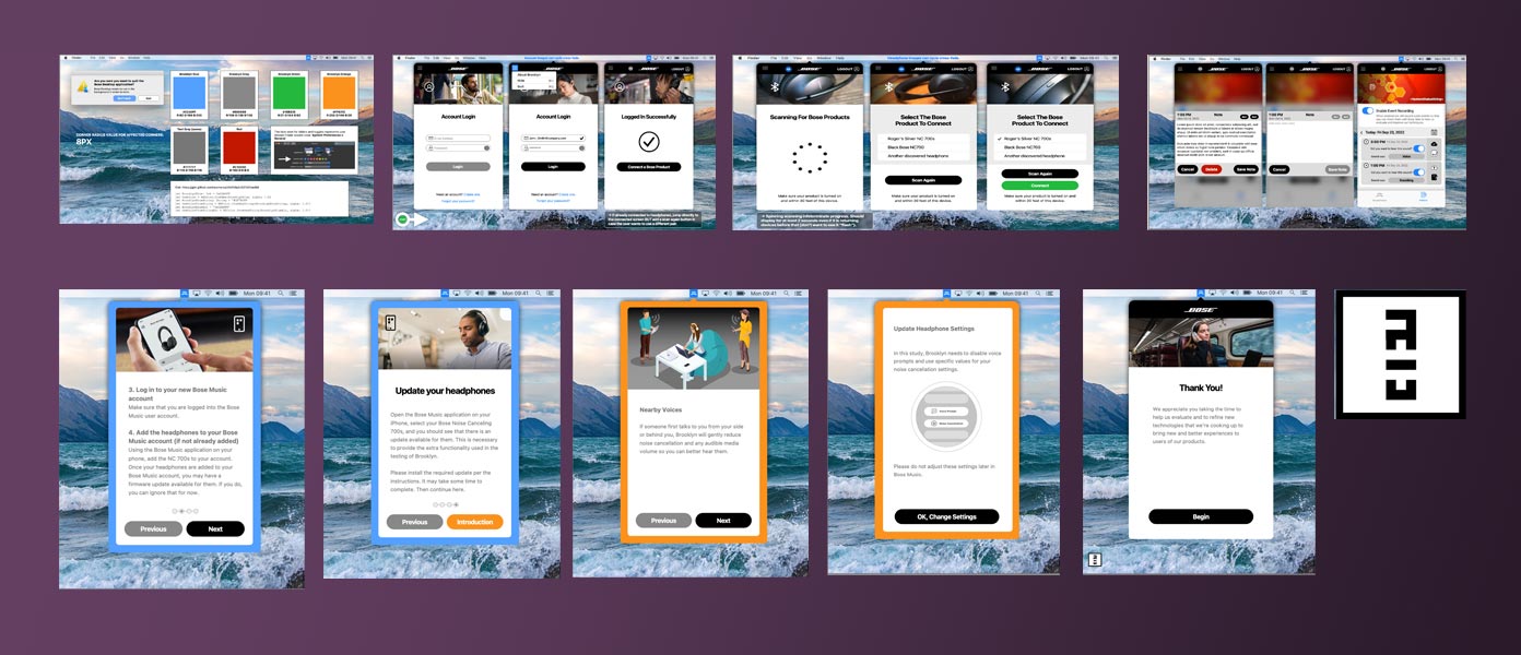
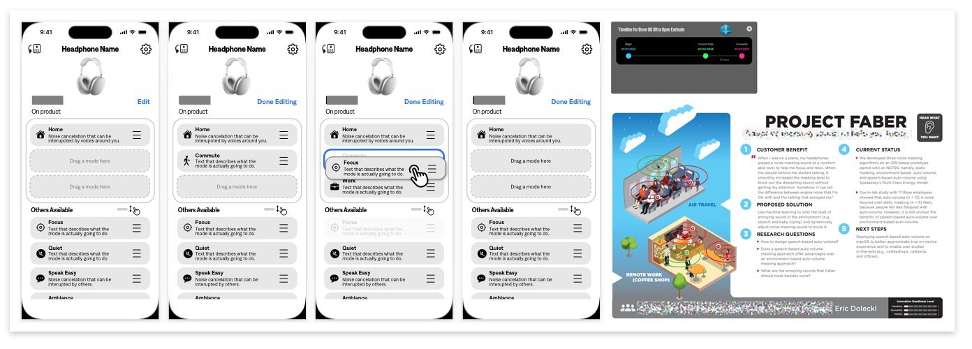
I deployed a wire-frame Customer Purchase Journey tool which allowed test users to select a home layout that roughly approximated their own. They ran through 3 scenarios of different budgets and different types of products - with their own prices. The user would drag and drop each desired product into the room of their choosing - while moving or removing items as they saw the budget impacted.
Once they finished their selections, they would send an email full of the results JSON to the user researcher. Then the user would proceed through all 3 scenarios. They were then asked qualitative questions about why they made the selections they did. What products did they already own to influence their purchase decisions? After a few rounds of testing, the tool was iterated and improved upon, yielding extremely insightful and easy to gather quantitative data with which to inform product marketing and products in the development pipeline.
Tools used: Miro, Slack, Trello, Visual Studio Code, Illustrator, FTP, GarageBand and Adobe Audition (for sound effects), and Teams. Did not need Jira.

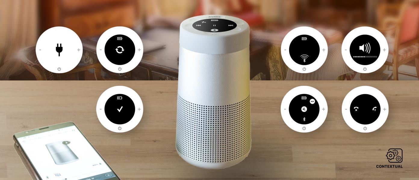
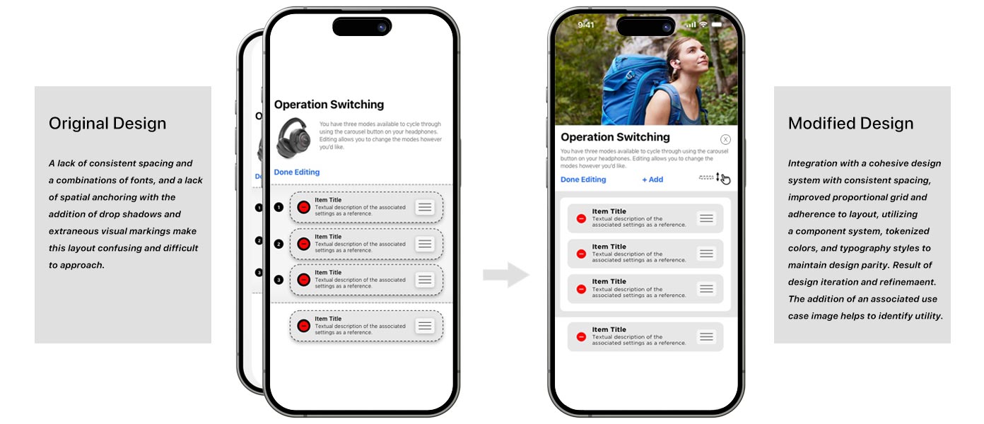
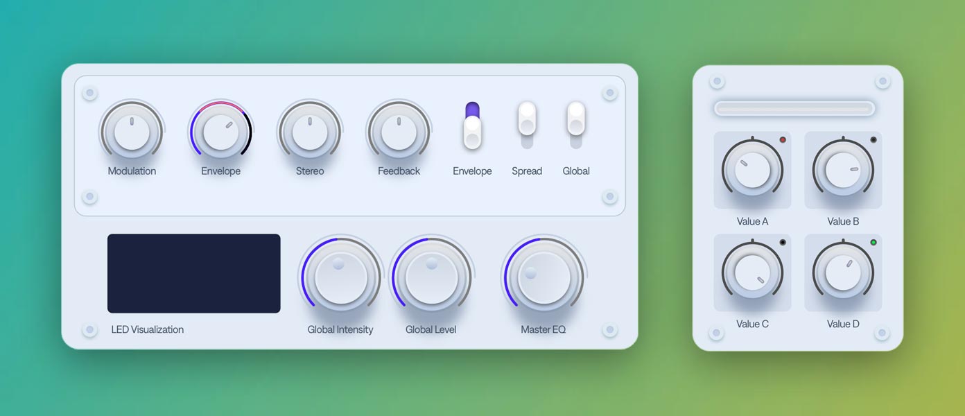
This is a single example of a hardware-software prototype of a desired user interaction model for this project. Several different techniques and ideas were considered and tested. The user interface had to only be good enough to allow stakeholders to set up and run on their own. It was a great way to test out ideas and to see if they were viable. It was also a great way to see if the idea was even worth pursuing. This was a successful prototype and was used to inform the development team of a desired interaction model.
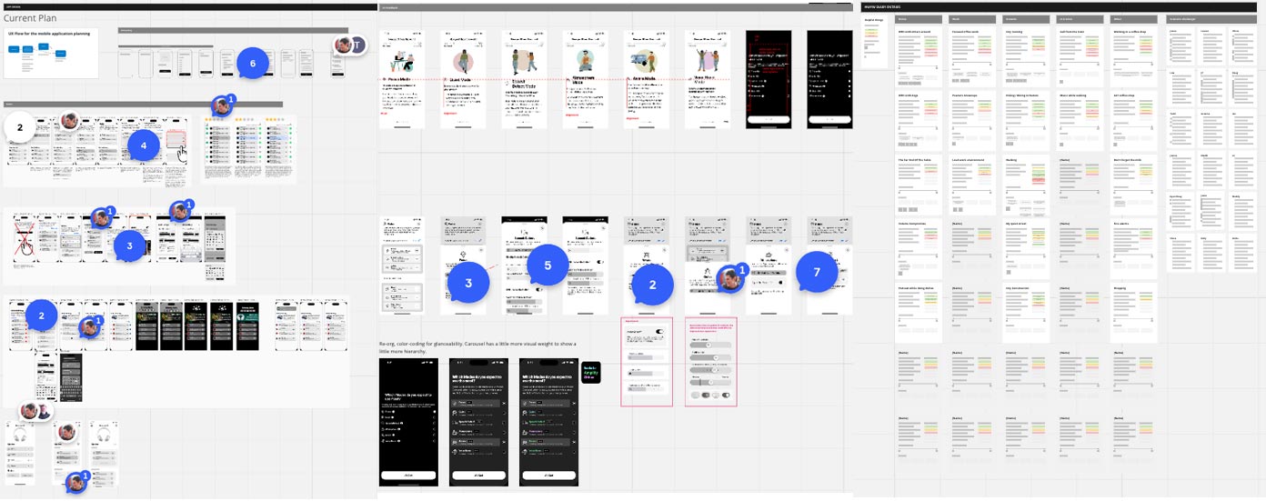
Prototyping
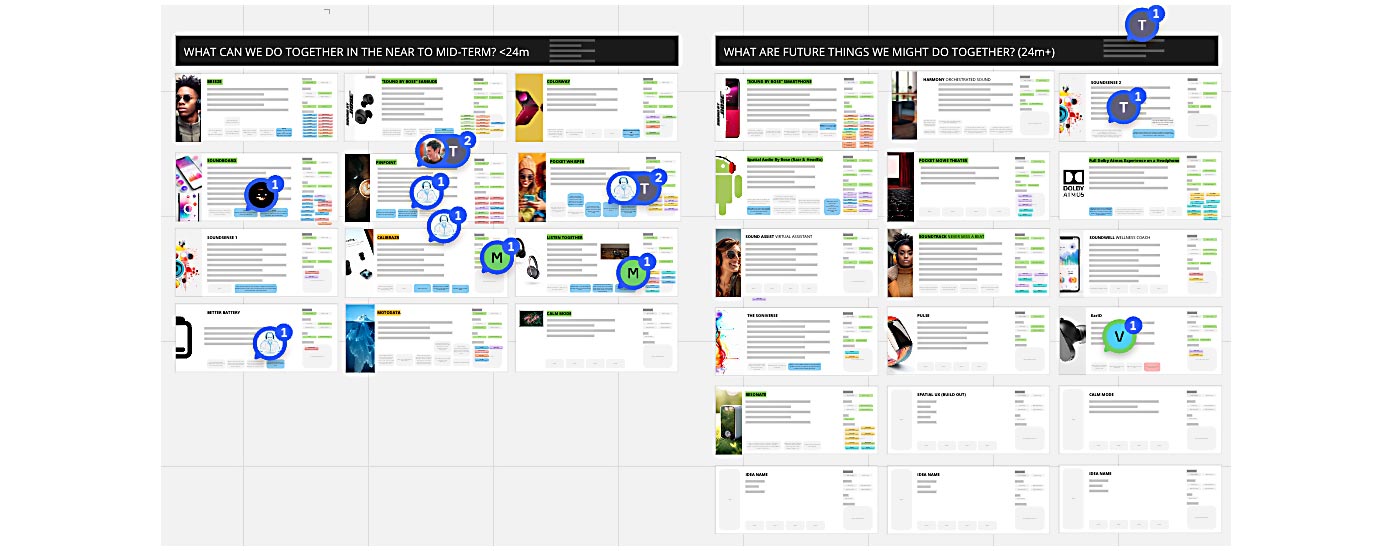
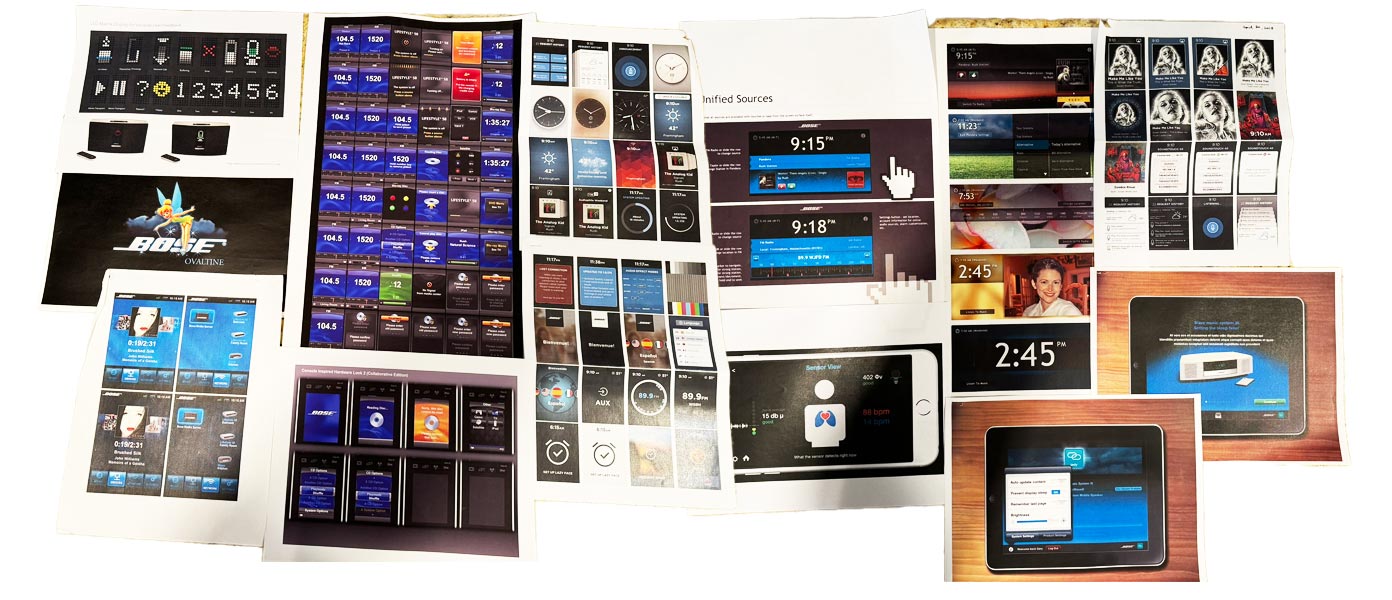
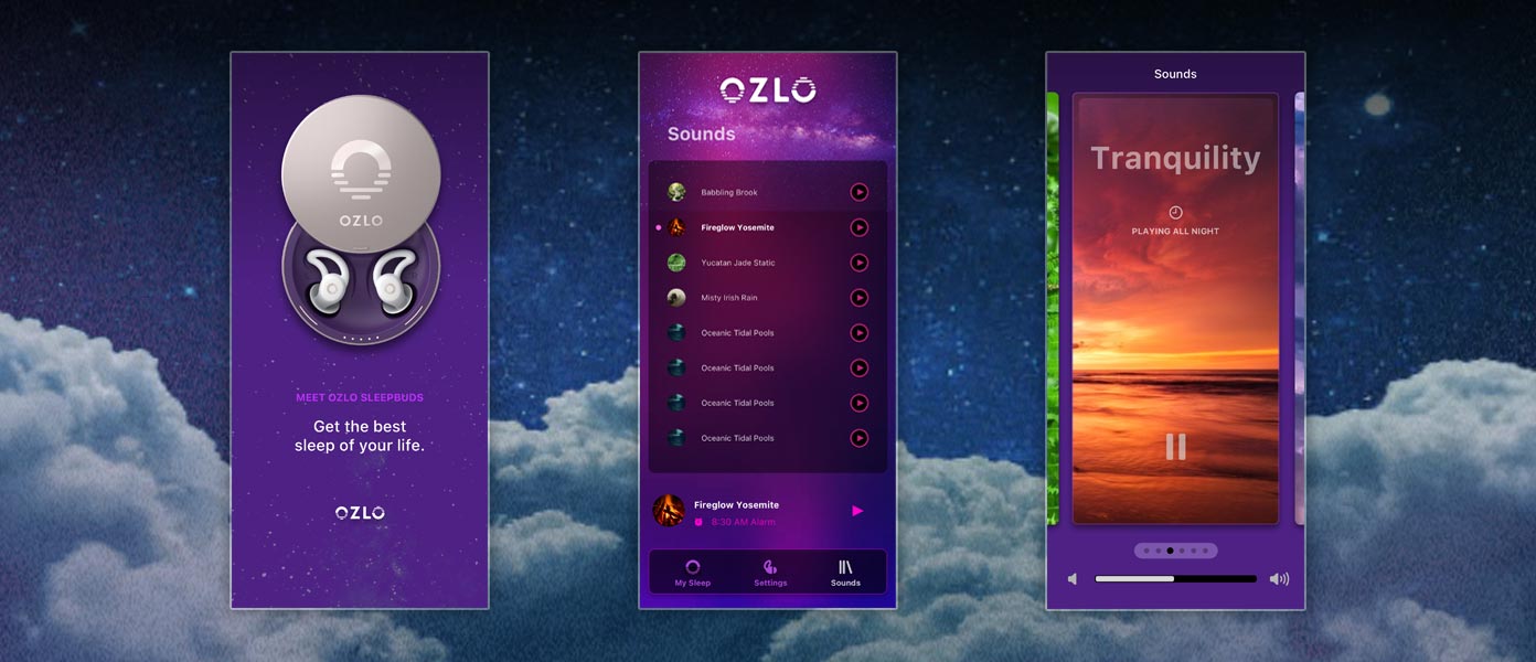
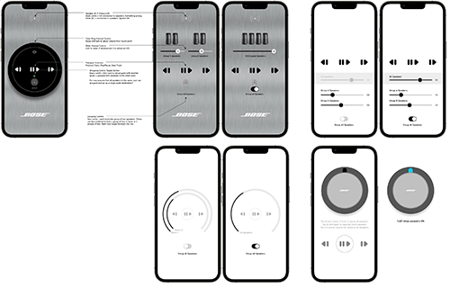
I have been fortunate enough to be assigned some very interesting and creative projects. I helped to concept, design, and plan the Bose Videowave television user interface while informing the remote control as well. I prototyped the entire experience, and you can read about that below. I helped design the full UI for a full-screen music player, only for us to be surprised when the iPod was released not long after. I designed the user interface for Bose Lifestyle systems as part of uMusic+. I prototyped a workout application for a very well-known athletic apparel brand that would translate your running cadence into musical beats that were slightly faster in order to help train athletes - and the audio was spatial, using onboard sensors in earbuds - generating custom music (with the beats) on the fly via stems and algorithms. I helped in a similar way working on a sleep program - a system which used a table-side breathing sensor and would entrain a user's breathing pattern to encourage a better night's rest. In effect slowing their breathing gently throughout the night. I helped prototype a 5G connected wearables that required VPA interaction models to be designed as the control and response UI.
I've been really lucky to have been able to collaborate and work on some great projects that asked, "What if?" Some of them actually shipped too, which isn't very common for a conceptualizing group member to be able to say often.
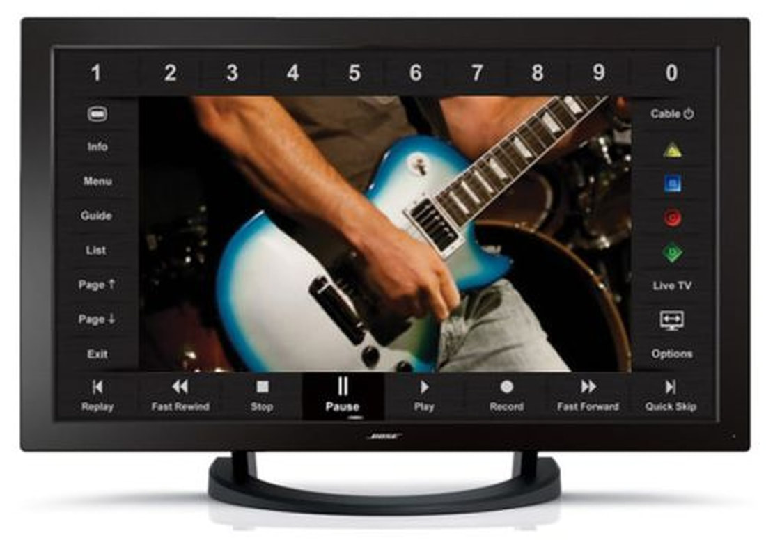
Bose VideoWave design
One of the most exciting projects that I have ever had the pleasure of working on.
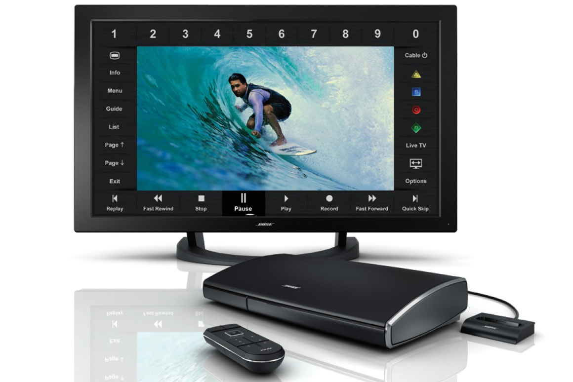
The VideoWave was born in the year 2010 and was sold until 2015. Notably, it contained an integrated bass module, wave guide (much like the Wave Radio only much larger and more impactful), and PhaseGuide radiators that could beam audio around a space in order to reflect off of surfaces - to replicate the effect of positional surround-sound speakers.
The product weighed over 100 pounds and was required to be installed via a white-glove service. Connecting to the panel was a Lifestyle AV system to allow for connections to other external devices and it also had DVD playback. It shipped with an iPod dock. It also came with a ground-breaking remote control that was contextual and allowed for magical navigation of the source you had currently selected.
The birth of the VideoWave remote control
I worked on the remote control and it's interaction with the display panel. It's easily one of the more exciting projects that I have ever helped design, prototype, and demo. The story of that remote and it's navigation system is intriguing and well worth a read.
One day I was sitting in the Bose Design Center and my boss came by our desks and was smiling from ear to ear. He had just come from a meeting of senior executives who relayed a desire of Doctor Bose. "I just heard that Dr. Bose would like us to design a remote control for a television. It can only have five buttons."
There was a moment of stunned silence, followed with some looks of dismay that slowly dissolved into a conversation of what that could mean, how it could be tackled, and the sketches began in earnest.
That kicked off a series of many related projects, each with it's own unique codename. There was the remote control itself. There was the user interface that had to go along with the remote. Then there was the connected Lifestyle box. Then there was the panel itself. There was remote to systems communication. There were all kinds of explorations that began. Through a series of design sprints, we had finalized concepts for a remote control - and one of them featured a kind of touch pad (we called a click pad), one that you might see on a laptop to drive the cursor without a mouse.
It originally did not have a directional-pad in it's cutout center. It only had a smattering of controls on it. It was a capacitive pad with a button mechanism underneath, with some buttons occupying holes that were drilled into a palm-sized piece pf sculpted wood. This was before the age of 3D-printing.

We never got the remote down to five buttons, but it inspired us and drove us hard to a great and optimized solution. We eventually decided to provide a directional-pad in the center of the touch surface, we gave it a power button, a source button, volume up and down, channel up around down, mute, and a "last channel" shortcut (previous).
Prototyping VideoWave
While the remote control was going through rounds of refinement, we held design meetings that centered around making the whole system very simple to use given the few controls we wanted to offer. Most remote controls of the day were grids of buttons with tiny labels that often caused confusion for users. The print on the buttons was necessarily small, with the number of typical buttons it could prove nearly impossible to remember what they all did. We wanted to alleviate frustration. We wanted to provide a powerful, capable, and dynamic system to those who might not be well-versed in technology. We wanted them to feel proud of their system and to want to show it off to their friends and family.
We wanted to provide contextual controls - offering only what you needed at any given time. Instead of relying heavily on a baked industrial design to provide all the required and desired functionality, we wanted to leverage the largest and most beautiful visual element of the system: the VideoWave screen.
Mapping remote touch to the screen
We had a remote that had a click pad - a square input surface that was visually comparable to the panel display in that each had four 90° angle sides to them. So there was a possible mapping to explore there. The remote supported clicking for entry - and swiping along each side. We could combine that with a visual representation of the interface on the television panel - in sync - so as you moved your finger along the click pad, we could show you where you were on that pad on the television. This was the first experimentation that we knew we needed to prove out. So I set out to prototype what we needed in order to convince key stakeholders that the experience could be easy to use, repeatable, and magical.
At the time, I chose to create a Flash Projector of a mocked-up television interface. At first the UI that we envisioned would overlay on top of the screen image. Since all of this could be licensed, I cannot divulge much in the way of visual design.
I found a movie trailer from am online trailer site and added it to the project - running in the projector with a semi-transparent frame on top of that. I did not yet have interface elements represented on the "track" - but I had a simple circular cursor that would represent the touch location of the user's finger on the remote click pad. I implemented keyboard input at first to get a quick stepping of position in place in order to see the cursor animating through positions along what we now called the "racetrack". So far so good, but nowhere near where things needed to go in order to really evaluate anything. Now comes the fun part. 
I got a pretty powerful PC that would drive the prototype. In it was a video card that Flash could access as a source of video content - so we had a cable box and subscription drop in the Design Center to allow live cable television to stream to the Flash Projector. So we had authentic television content playing in the fullscreen prototype now.
To change channels we needed to control the cable box - so we had an engineer gather up the IR codes we would need to support and put them into an IR blaster that was connected to the PC. Using an API through Flash, we could send IR commands to the cable box. Things like channel up, down, and others you would expect to have support for. The first source we prototyped was that cable box.
Contextually in cable source, we needed to provide a user interface that allowed access to the common features. We sketched and discussed and designed, and came up with prioritized zones of input. The top would be for numeric channel entry. The bottom would be for transport controls. The left for common features like Info, Menu, Guide, etc. The right side was relegated to things like source power, Options, etc. Things you might not need as often. It took rounds and rounds of experimentation to get the cursor mapping to work naturally given that the panel was wider than it was tall and the click pad was square. I decided that depending on the content (chyrons for example) would be occluded by the overlaid racetrack - so when brining the racetrack UI up, we would scale the video down to make way for it. Animating the track into position at the same time. It was magical and brought people a lot of joy to see the interaction take place. It was definitely something they would like to show off to a room full of visitors.
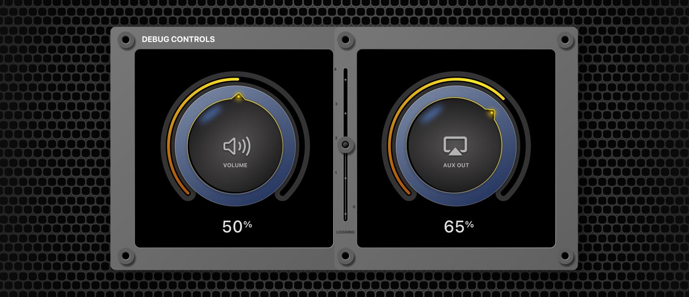
I coded into the prototype a custom UI that allowed us to tweak settings - such as animation speeds for all the different interactions, the amount of trigger ramping we allowed to help speed intended movement into widget highlighting, etc. That was so that we wouldn't need to change settings, build, and then test. We could tweak it as we went without needing all those builds. You could call up the UI with a keyboard entry of "b" and drive it with the PC's mouse. The mouse was normally hidden in the prototype, but when the debugging UI was up, it would display to allow easy PC-centric use.
Using real user input data
We had a tethered remote control to begin with. It's buttons were mapped, so I could fire off the correct IR codes to the box and control it. I received x & y positions from the pad, so I was driving cursors in various forms around the racetrack. We named the cursor Tinkerbell. I can't remember why - but it was fun. We didn't want to occlude the widgets in any way, so it ended up being a sliver of light that would smoothly navigate.
It became a vital aspect so that users could reliably interpret it's movement and know how close they were to highlighting the next widget. It brought a high-level of confidence to the whole experience and made it very repeatable. You wouldn't need to think about what you were doing - you'd just do it.
Over time the threshold meetings started taking longer and longer as aspects were refined and tweaked. We had a deadline and I remember vividly that we had one gate left. If the input system and on-screen display wasn't operating perfectly and with no input error, we wouldn't pursue it any further - we'd have to use an alternative input method for the remote that wasn't nearly as fluid but was dependable.
which inputs were communicated. I was working with another team to tweak the IR as needed. We put the whole prototype onto a rolling cart so that it could be moved around for demos. We implemented "magnetic" and expanded "hit areas" on the pad - mathematical optimizations to allow for easier movements of the cursor and alleviating clicks that might be close to another widget. Things were smoothed out and for one of the last meetings before being green-lit - it was smiles all around. "You know what ladies and gentlemen? I think this is awesome and I think this will be a hallmark feature. We've got to ship this!"
With that, I started to work with the development team that would be implementing the live graphics. I originally wanted to supply PDFs for each of the multitude of widgets we'd need to display - so as to be size agnostic and allow for different resolutions in the future, but there was some kind of problem with the initial rendering engine and we opted for bitmaps. Later when we unscaled the panel and started to hear about new resolutions, we knew that sets would need to be made to match. Not a small feat, but doable. PDF support would have been wonderful, but for the time being things looked and worked great.
So I carefully crafter each widgets in various states of display - normal, cursor nearby, highlighted, etc. I crafted the cursor element and the various panes that would host numeric channel entry, iPod interface (we shipped with an iPod dock as I recall) - all based on our 46" panel display. Sketches preceded widget designs, and I came up with several systems to try out on the real hardware. We ended up going with larger content in the widgets to aid in visibility. The VideoWave was an expensive system, around $5,000. The clientele skewed older and thus we wanted aging eyes better opportunity to navigate the system.
I won't go into too much more detail. Through hard work, multi-disciplinary collaboration, dedication, creativity, sketching, design thinking, lots of coffee, design meetings, critiques, and precision - we delivered a wonderful input system for our customers. There were many factors that limited the availability of the VideoWave and caused us to mothball the product, but it's one of the few things I worked on that shipped. Most of the things I have worked on get folded into other concepts or are not shipped - which I am not at liberty to discuss because of confidentiality. I take that most seriously. I remember something very interesting about the VideoWave though...
My kids lose their s***.
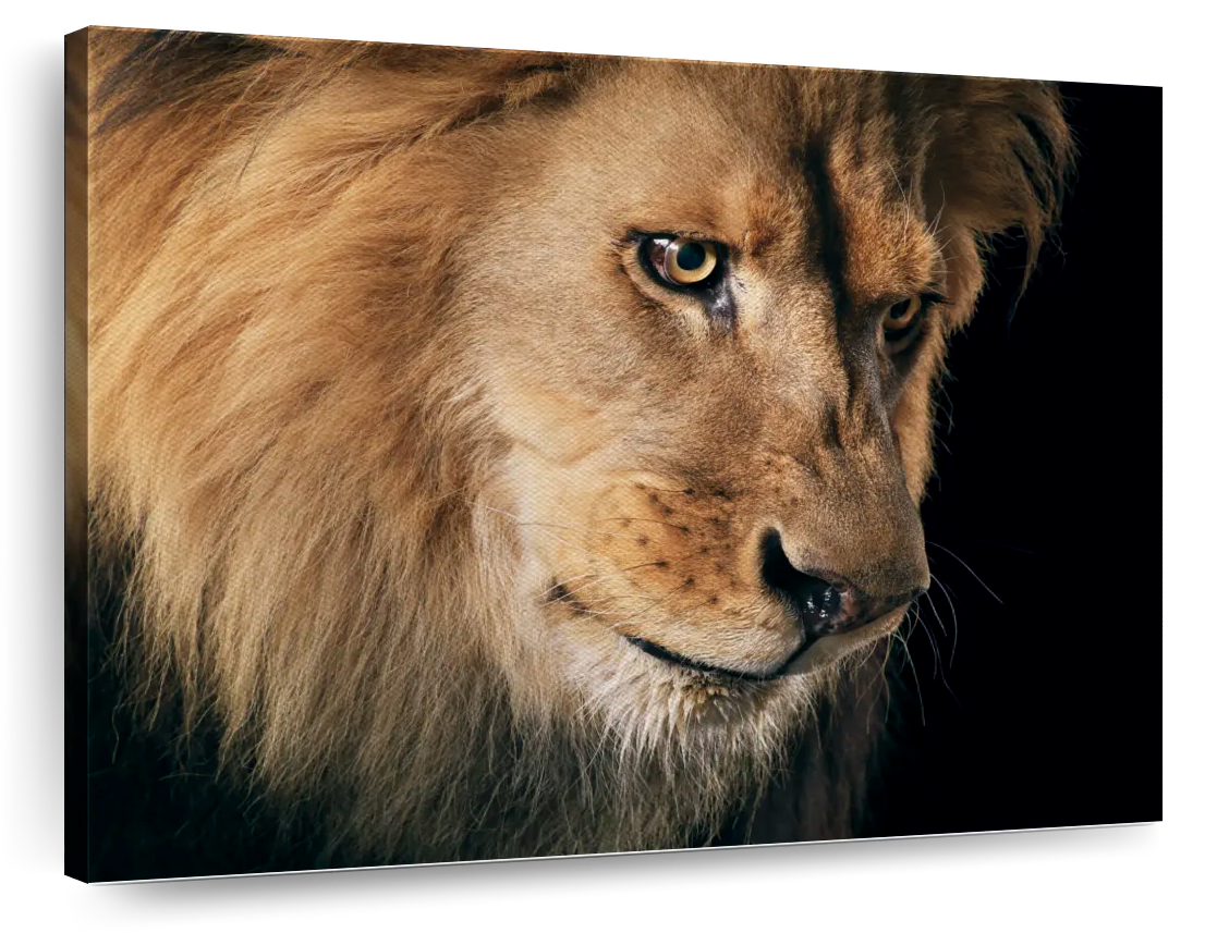
I was very proud of the VideoWave when it came out. Nearby, tucked inside a Jordan's Furniture store in Natick, MA was a large Bose retail store. I took my wife and kids there to see a finished system to watch a demo. In a side room Bose had the panel on the wall with satellite speakers sprinkled around the room on stands with black cloths over them. You'd sit in this living room and experience a demo video that ran on the connected AV box.
My kids were young, and while most of the demo was indeed spatial and impressive - at one point in the demo you'd hear a lion roar off in the distance, and then suddenly you'd see it appear on screen and hear it at full volume. My kids absolutely freaked out it was so realistic and surprising. We couldn't finish the demo. I took pride in telling the retail employees I worked on the project and wished them good luck as we each walked out with a child held in our arms.
Sketching & Skills
I love to use a fountain pen while sketching. No desire to erase, and the lines are very expressive. My favorite pen has been a Lamy Safari (yellow and white), while the notebooks are cork-covered Lemome Dotted Bullet. I'm not sure if they are available any longer, so its a good thing I bought several.
When it comes to ideas, I usually have a grand vision in mind but sketch out and conceptualize the lowest-fidelity possible at first in order to save time. If a concept gains enough traction to pursue further, then the concept can be re-evaluated and prototype experiences improved around the main feature set. Test internally before taking anything outside. If an experience needs to more closely resemble an existing offering, or be high-fidelity as part of the experience, that's alright too. The mantra is fail early and often while expending the least amount of work until something catches fire and holds. 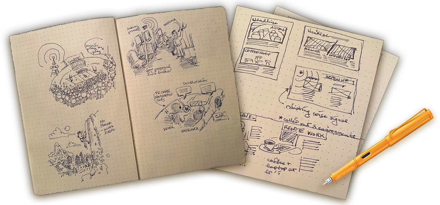
- Hand sketching
- Persona creation
- Storyboard creation(sketched and/or digital)
- Digital diagrams
- Product journeys
- Mood boards
- Swift | Swift UI
- JavaScript
- PHP
- HTML | CSS
- Jira
- Trello
- Miro
- Figma & Sketch
- Situational vision videos (various fidelity)
- After Effects video examples
- Proof of concept web or Playground examples
- Sketch/Figma Design/Prototypes
- Javascript prototypes
- Asset generation
- Adobe CC
- Paper prototypes
- Wizard of Oz experiences
- Low-fidelity prototypes (web/iOS/Arduino/etc.)
- Medium-fidelity prototypes (same)
- High-fidelity prototypes
- Audio generation for feedback
All of the above to be evaluated with project team members, recruited internally within the company, or with external participants - by Quantitative and/or Qualitative data collection.
Sometimes data formats and schemas are designed or suggested in order to anticipate and make known how certain data might be shared in a prototype. It can also kick-start conversations in regard to ways to architect things.
Eric's ingenuity and dedication were pivotal in bringing my vision to fruition. His expertise, dedication, and innovative approach make him an invaluable asset to any team.
His passion and energy, yet open-mindedness are constructive and valuable in a difficult creative space. His deep experience, technical skills, and most of all his genuine interest in solving human problems is a rare combination.
He was regarded as a great collaborator, and thought partner/coach to other engineers and designers in the organization. He was also well-regarded as being patient and defusing unnecessary drama in contentious situations.
Beyond being terrific at his job, Eric is an immaculate person who's a joy to work with. Eric is the real deal. Having him on the team is a major cheat code.
Eric delivers the goods on the regular. He's a thorough and timely concept engineer who integrates into complex teams easily. I watched him navigate our tougher customers, both internal and external, with ease. Partners would ask for Eric to join new project work constantly.
Eric used his technical skills to create working prototypes, while also helping to devise great user experiences that could be adapted to the broader product lines. I can highly recommend Eric to anyone who needs a great developer who is not afraid of hard problems. And who is also a joy to work with!
His graphic skills, static and time-based, allow him to create stunning, interactive demos of future products that allow us to successfully sell concepts to key stakeholders time and time again.
Eric has been one of my most inspirational UX designers to work with: calm and respectful in all circumstances, with a deep love for continuously pushing the technical envelope and strong sense for aesthetics. What a rare combination!